
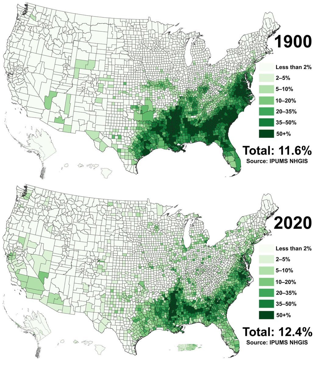
@scarlett_sComparing Black population share across U.S. county data from 1900 against 2020
Ver publicação original@scarlett_sComparing Black population share across U.S. county data from 1900 against 2020
Ver publicação originalFoto de @scarlett_s· Oct 11, 2026· United States
The image displays two maps of the United States, one labeled "1900" and the other "2020". Both maps use varying shades of green to represent percentages of something, with a legend indicating categories from "Less than 2%" to "50+%". The maps show a significant concentration of darker green in the southeastern US in both years, though the pattern appears to have shifted slightly westward and thinned out in some areas by 2020. The overall mood is informative and data-driven, resembling a chart or infographic. Notable details include the total percentages displayed below each map: "Total: 11.6%" for 1900 and "Total: 12.4%" for 2020, along with the source "IPUMS NHGIS".
 2McGregor Lake restoration complete
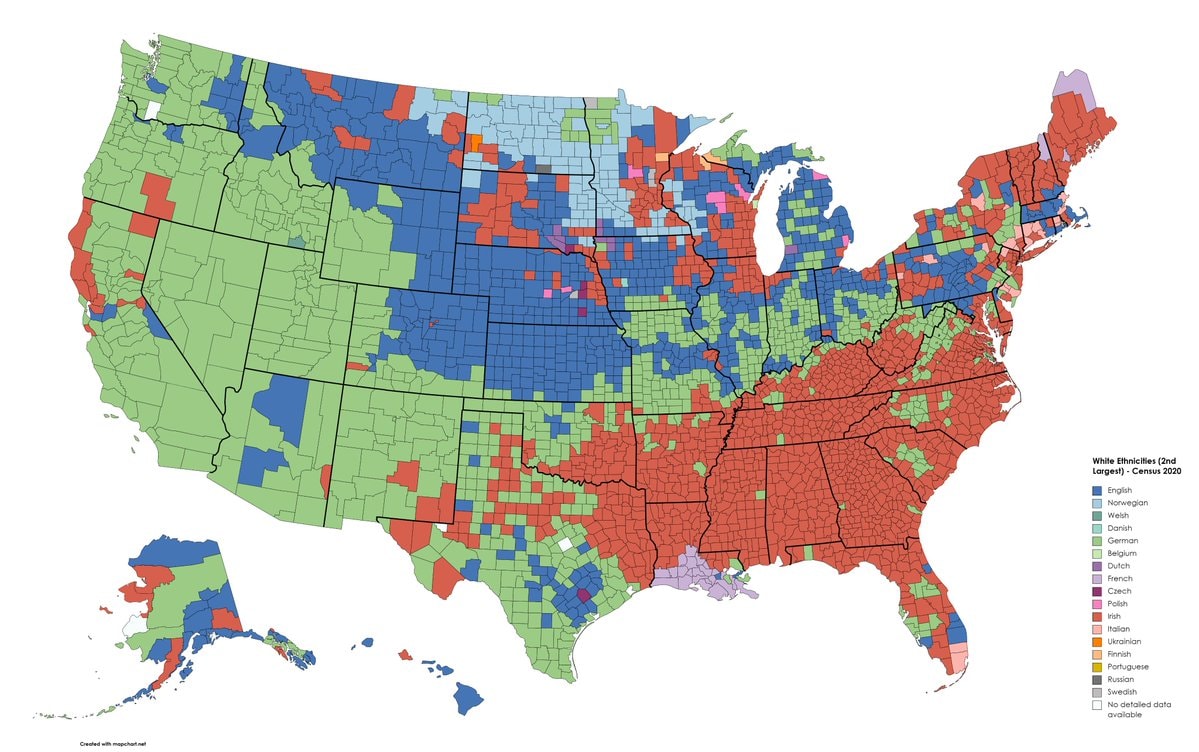 Second Largest White Ethnicities by U.S. County
 Critical minerals deal and unconditional support
 2Anitta on Bolsonarism and Lula
 US AI labs assessment
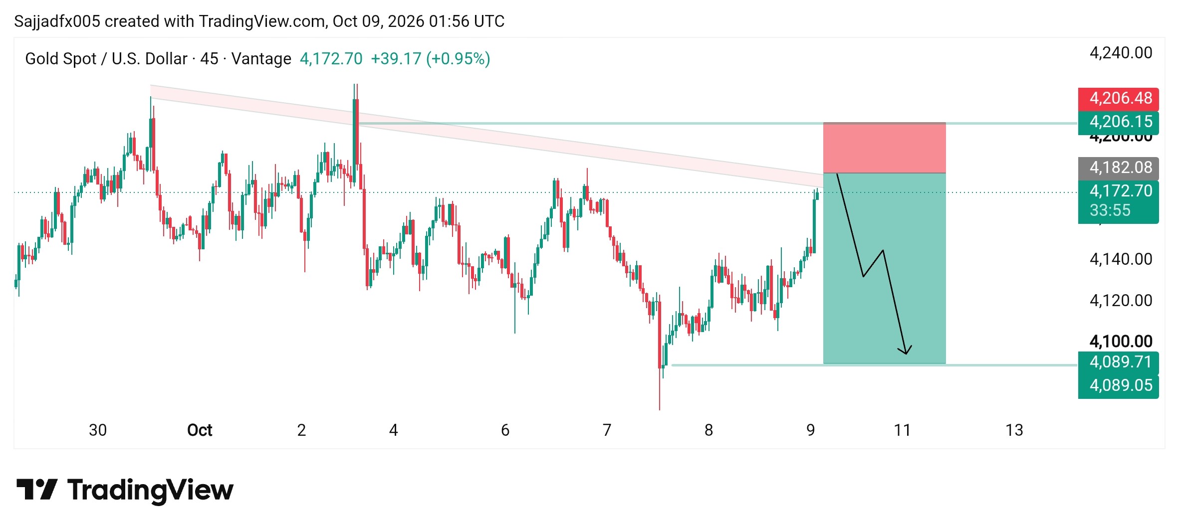 Gold
Gold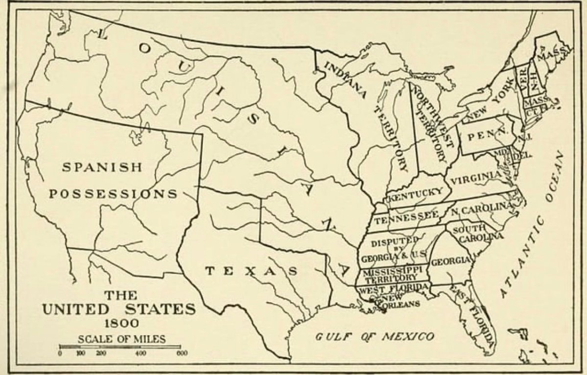 United States map 1800
 Trump Iran Election Statement
 2Elon Musk SpaceX Starlink US
 Cilia Flores and Nicolás Maduro
 Nicolás Maduro US charges
 2RFK Jr. nationwide vaccine probe
 2Nicolás Maduro US charges
 JD Vance accuses US companies of fraud
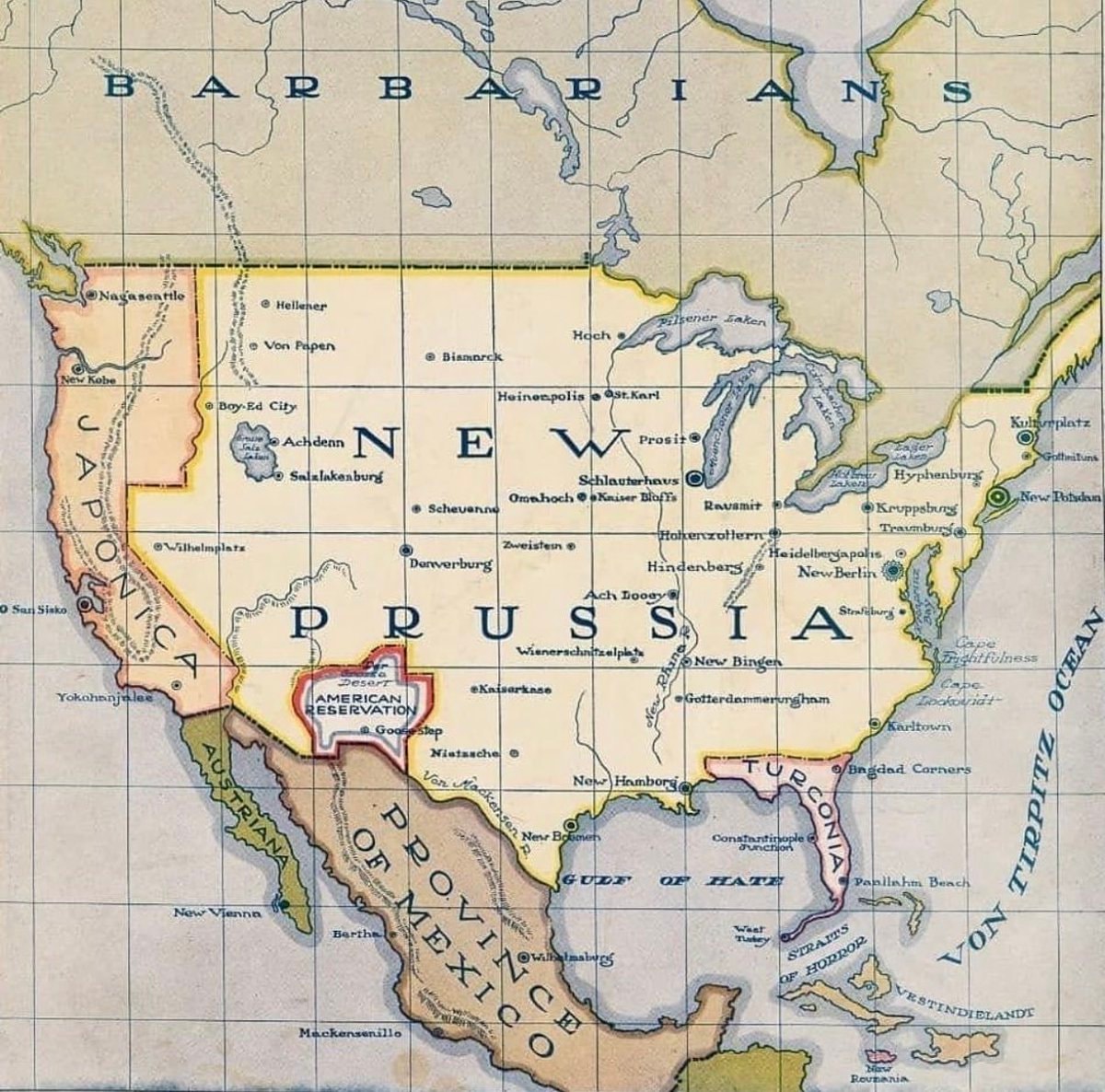 Life magazine 1916 cover New Prussia
 3Jaguar Type 01 electric sedan
 Oil up 5% on U.S. Iran strike reports
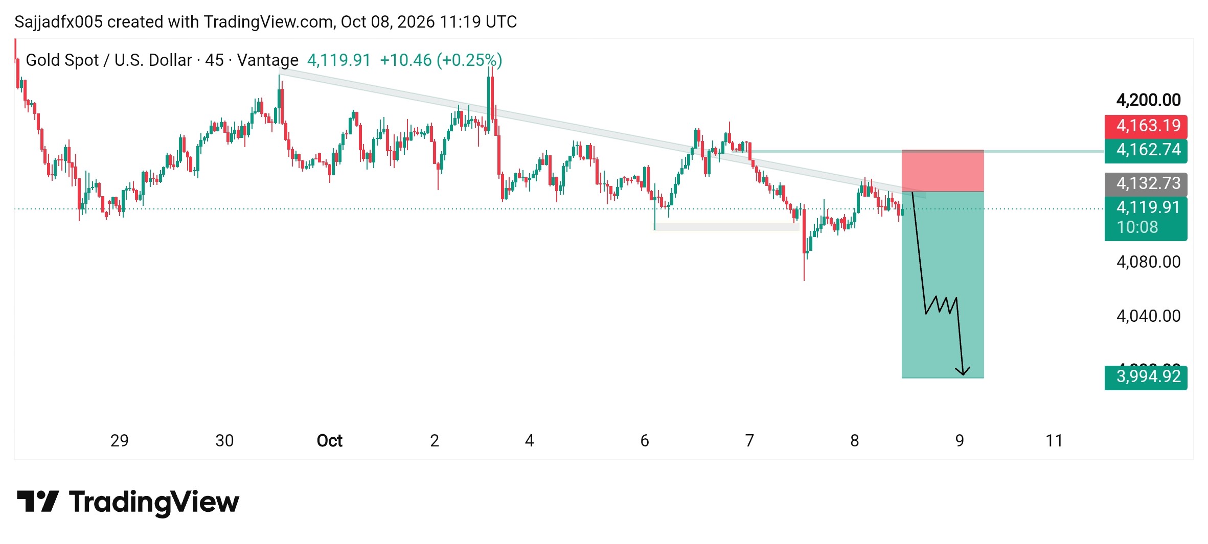 Gold
Gold@scarlett_sComparing Black population share across U.S. county data from 1900 against 2020
Ver publicação originalFoto de @scarlett_s· Oct 11, 2026· United States
The image displays two maps of the United States, one labeled "1900" and the other "2020". Both maps use varying shades of green to represent percentages of something, with a legend indicating categories from "Less than 2%" to "50+%". The maps show a significant concentration of darker green in the southeastern US in both years, though the pattern appears to have shifted slightly westward and thinned out in some areas by 2020. The overall mood is informative and data-driven, resembling a chart or infographic. Notable details include the total percentages displayed below each map: "Total: 11.6%" for 1900 and "Total: 12.4%" for 2020, along with the source "IPUMS NHGIS".
Ainda não há comentários. Seja o primeiro!
2McGregor Lake restoration completeSecond Largest White Ethnicities by U.S. CountyCritical minerals deal and unconditional support2Anitta on Bolsonarism and LulaUS AI labs assessmentGoldUnited States map 1800Trump Iran Election Statement2Elon Musk SpaceX Starlink USCilia Flores and Nicolás MaduroNicolás Maduro US charges2RFK Jr. nationwide vaccine probe2Nicolás Maduro US chargesJD Vance accuses US companies of fraudLife magazine 1916 cover New Prussia3Jaguar Type 01 electric sedanOil up 5% on U.S. Iran strike reportsGold
Ainda não há comentários. Seja o primeiro!