
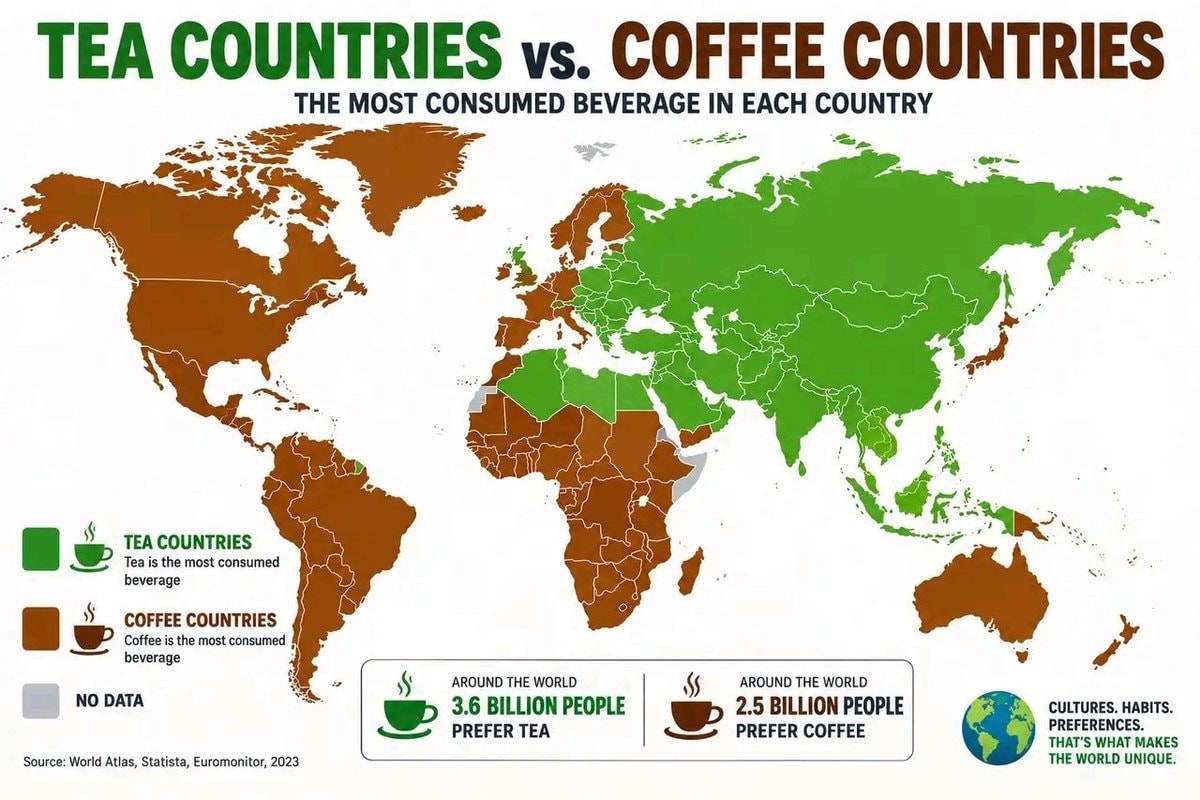
@savageupdatesBro actually comparing nations where tea is the main drink versus places where coffee rules, different populations drinking different things
Ver publicação original@savageupdatesBro actually comparing nations where tea is the main drink versus places where coffee rules, different populations drinking different things
Ver publicação originalFoto de @savageupdates· Oct 6, 2026· Info/Editorials
The image is an infographic comparing tea-drinking countries and coffee-drinking countries. A world map is colored green for tea countries and brown for coffee countries, with a legend explaining the color coding. Below the map, statistics show that 3.6 billion people prefer tea and 2.5 billion people prefer coffee. The overall style is informative and data-driven. Visually notable are the distinct color blocks representing the beverage preferences across continents and the clear presentation of global consumption data. ON-SCREEN TEXT: TEA COUNTRIES VS. COFFEE COUNTRIES THE MOST CONSUMED BEVERAGE IN EACH COUNTRY TEA COUNTRIES Tea is the most consumed beverage COFFEE COUNTRIES Coffee is the most consumed beverage NO DATA AROUND THE WORLD 3.6 BILLION PEOPLE PREFER TEA AROUND THE WORLD 2.5 BILLION PEOPLE PREFER COFFEE CULTURES. HABITS. PREFERENCES. THAT'S WHAT MAKES THE WORLD UNIQUE. Source: World Atlas, Statista, Euromonitor, 2023
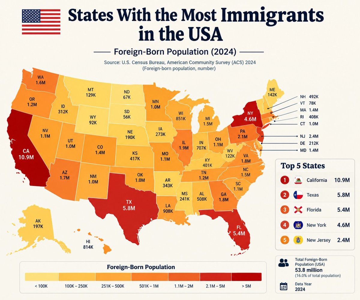 US States Immigrant Population Ranked
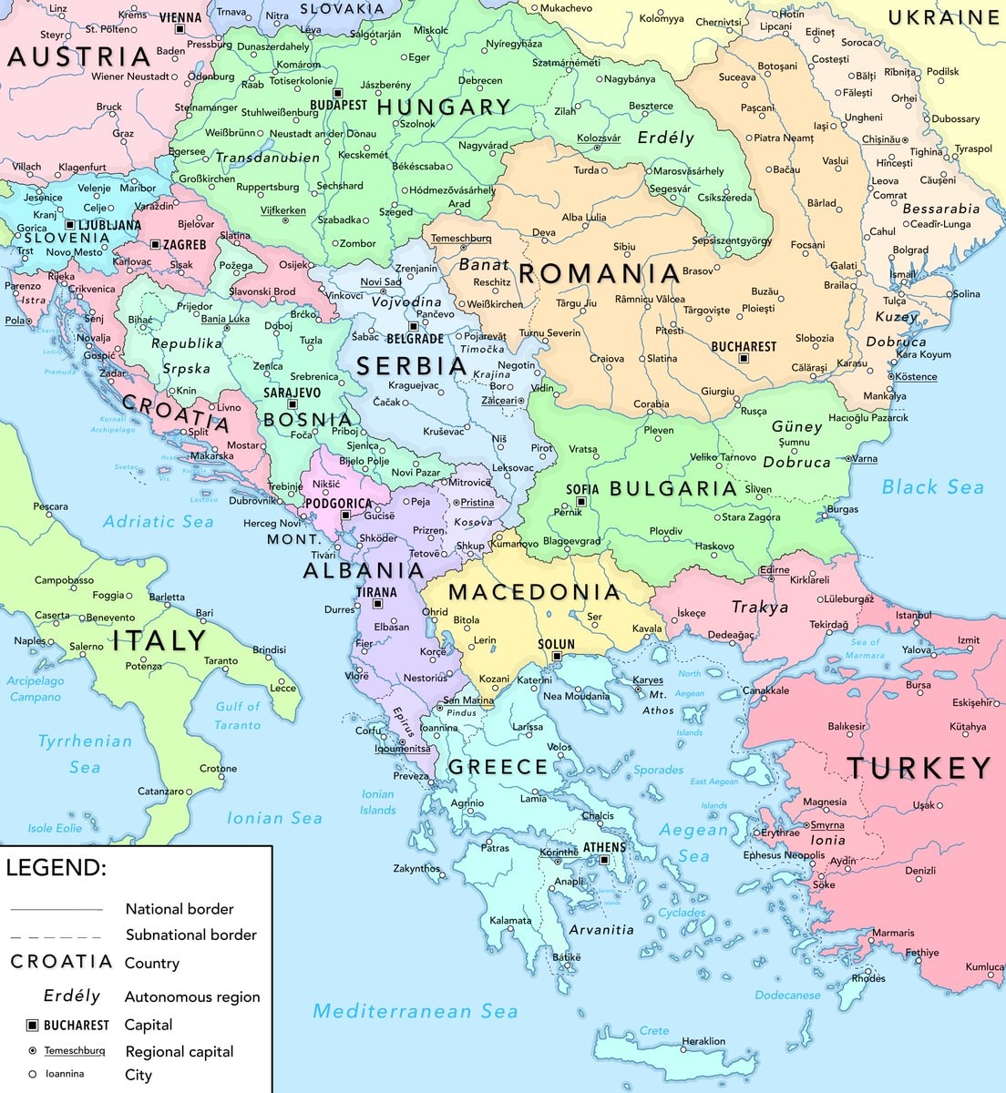 Balkans fair division 2026
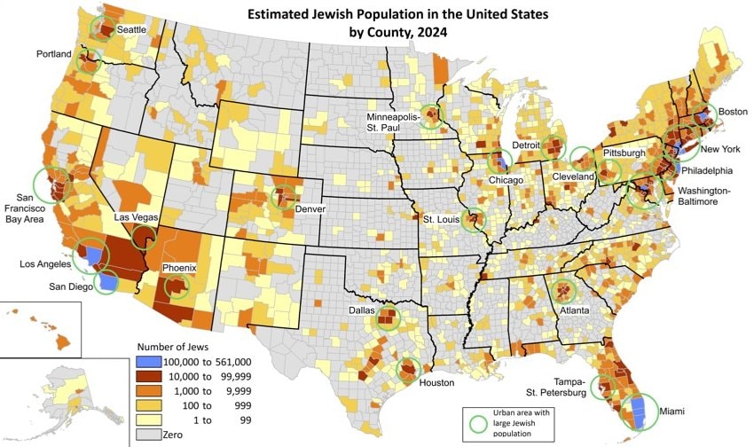 Jewish population by U.S. county
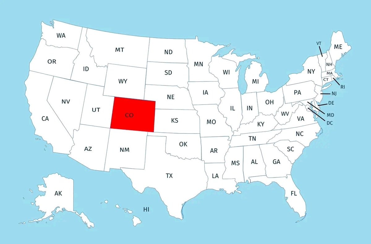 US states above 1000 meters
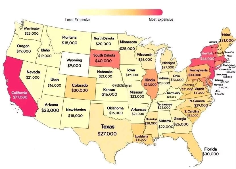 wedding costs by state
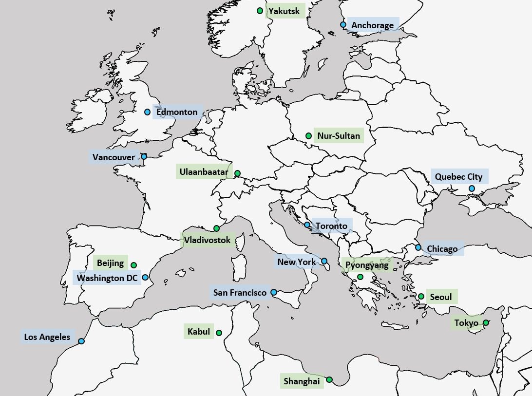 World cities aligned with Europe latitude
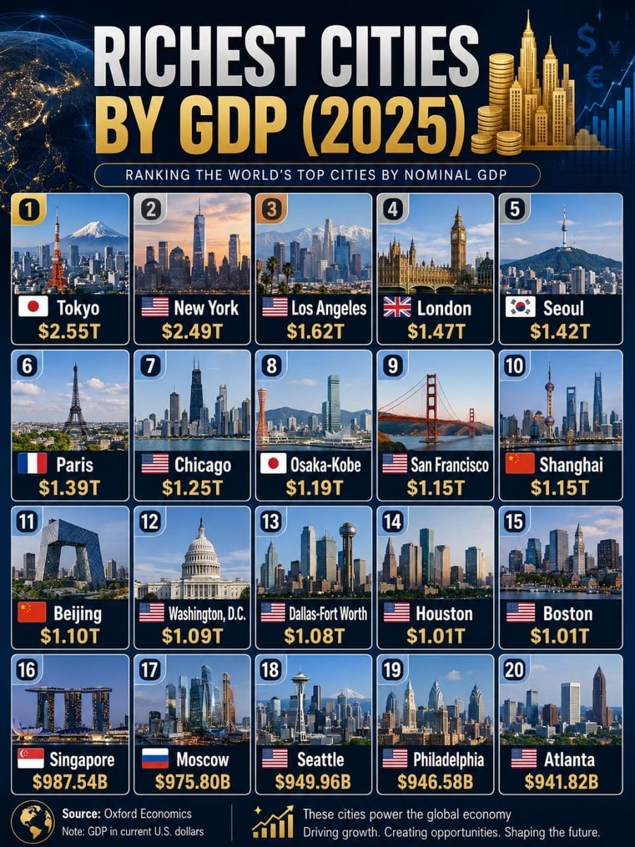 Richest Cities by GDP 2025
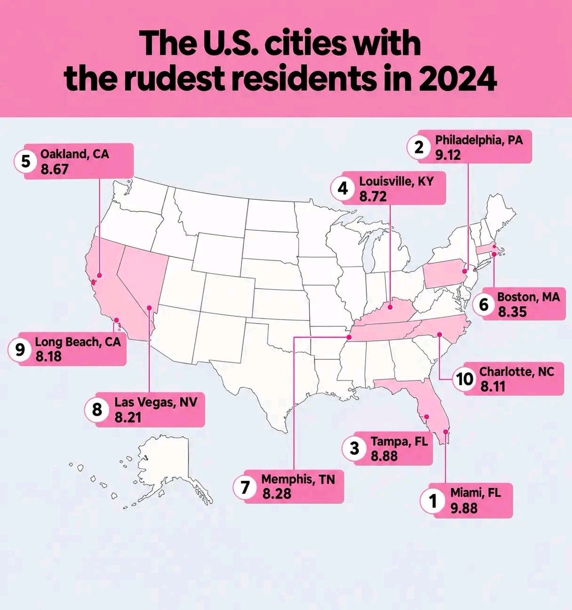 US cities rudest residents 2024
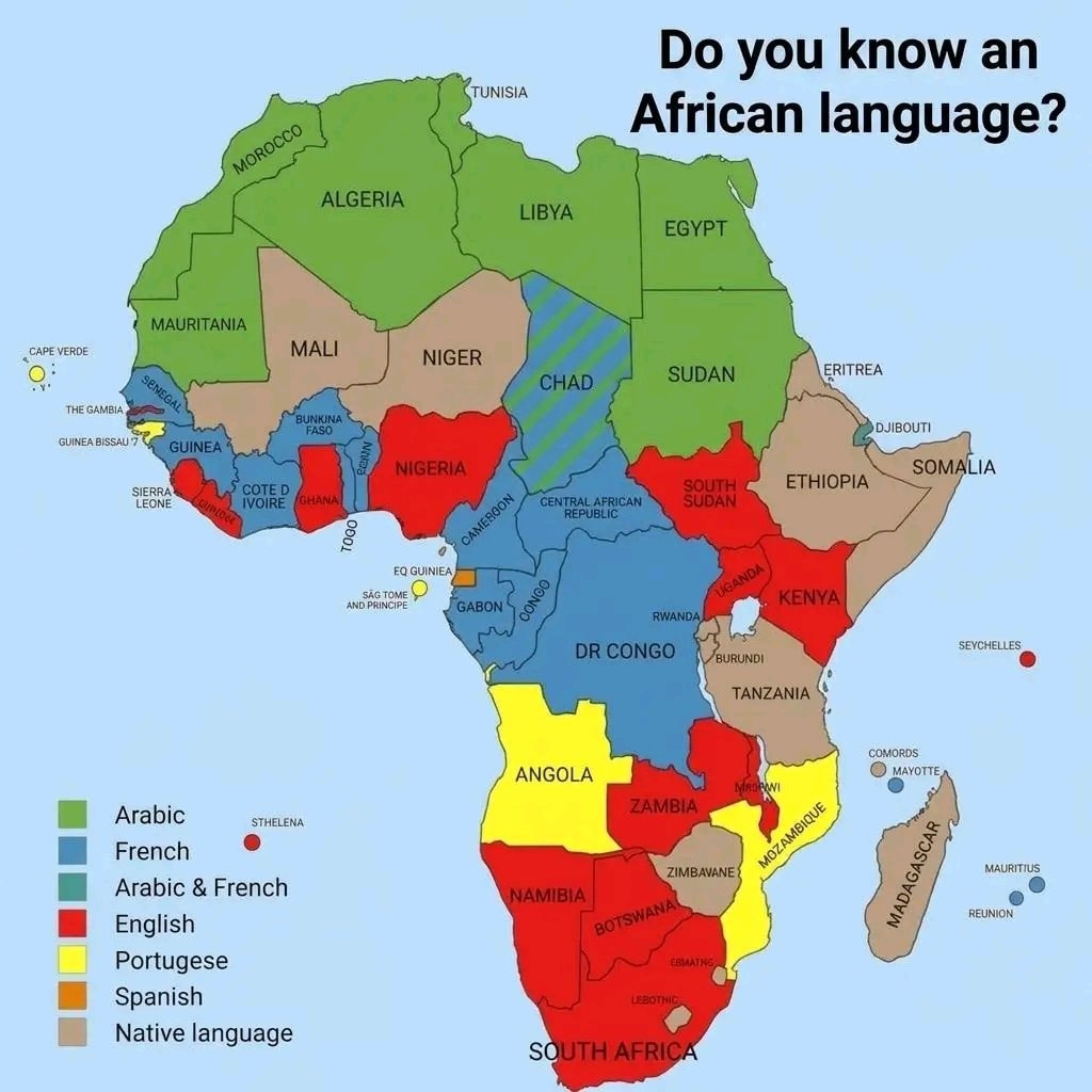 languages of Africa map
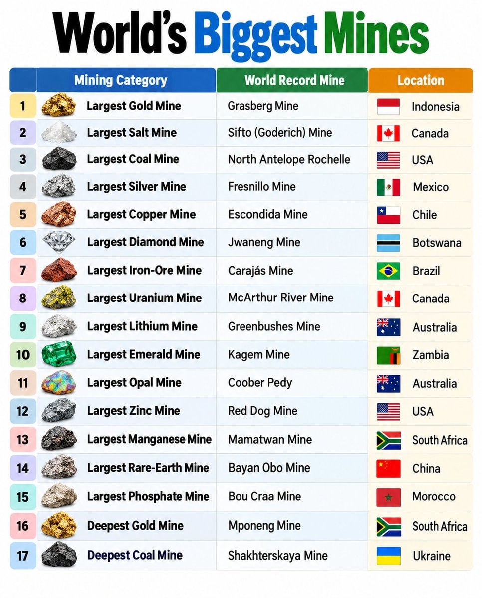 world's biggest mines infographic
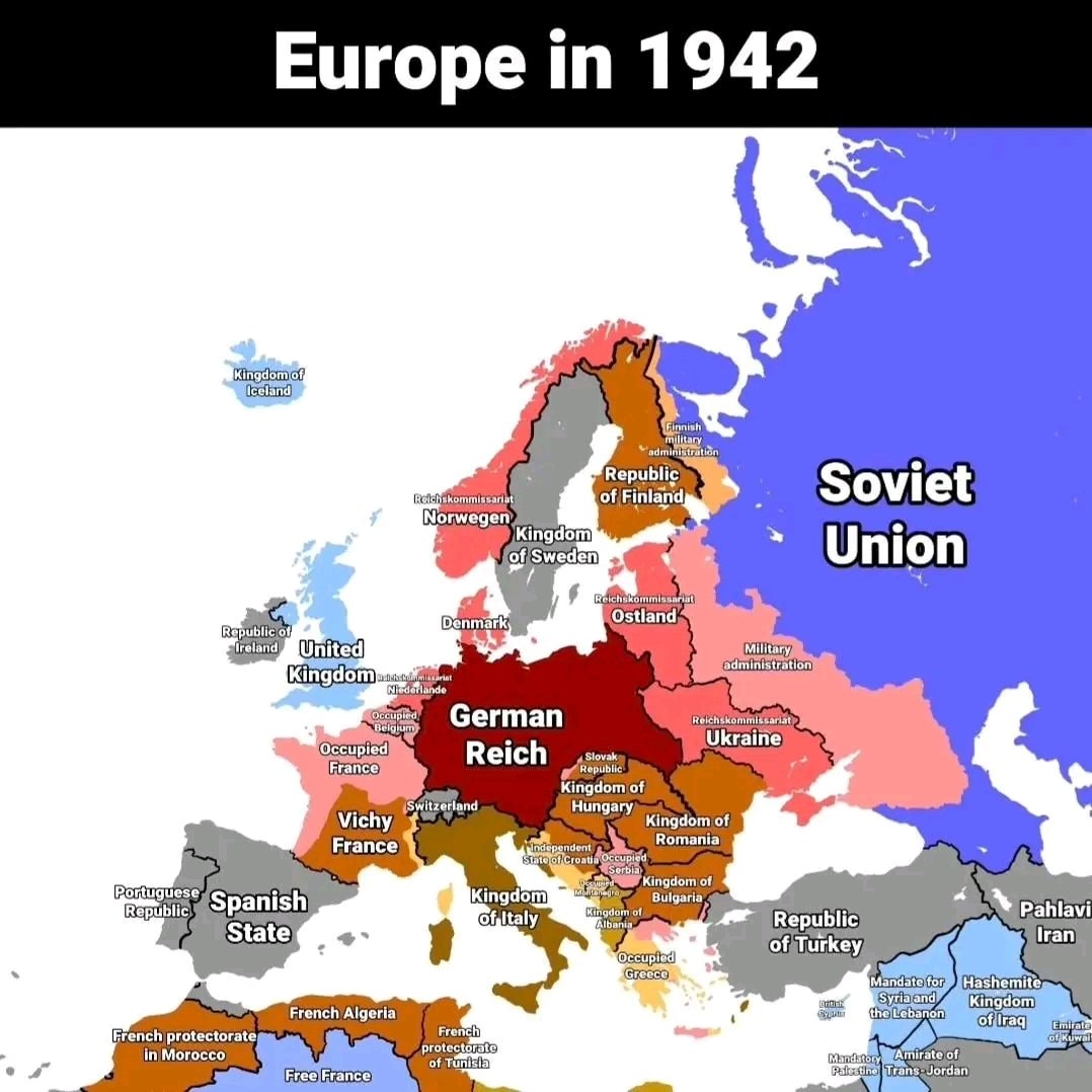 Europe in 1942
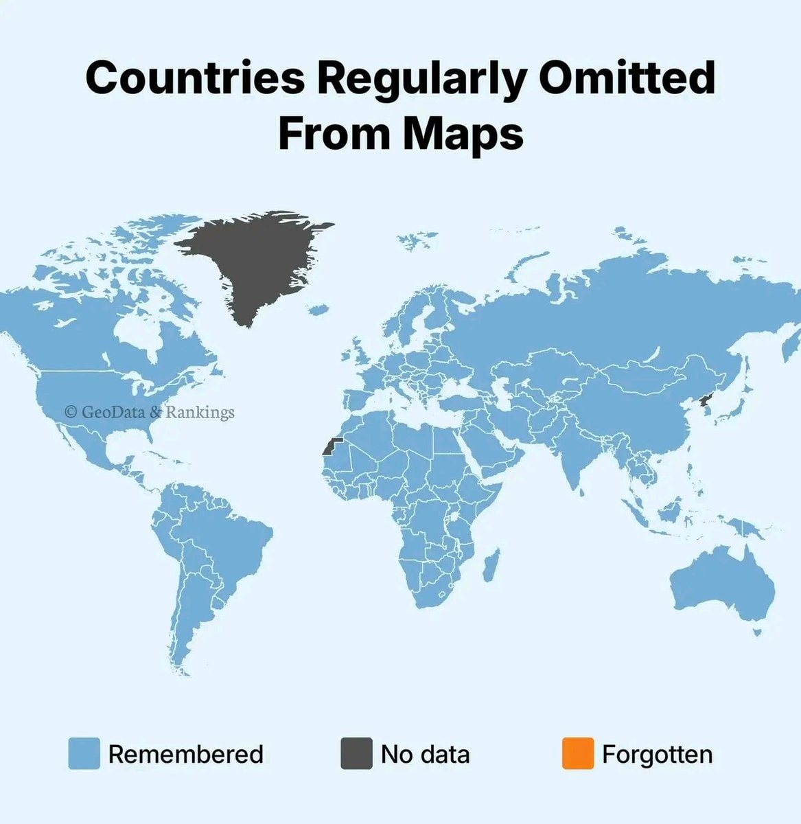 country always forgotten
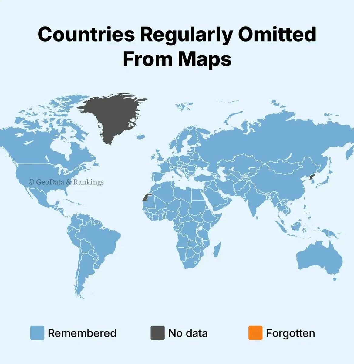 Countries omitted from world maps
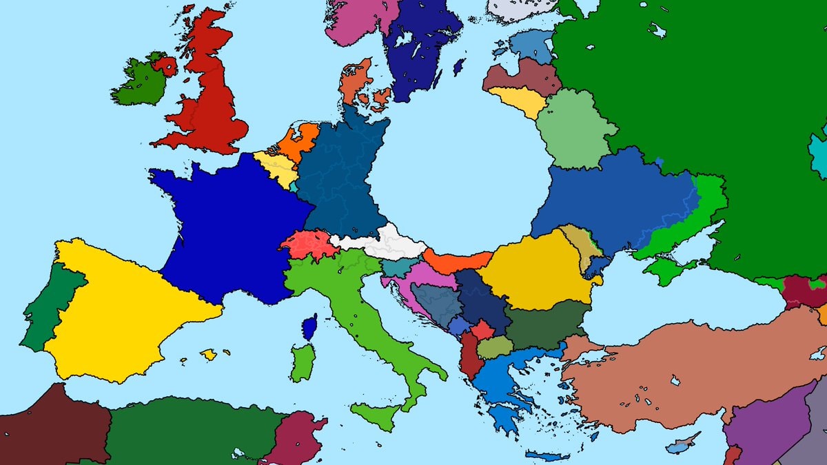 central Europe Gulf of Germany map
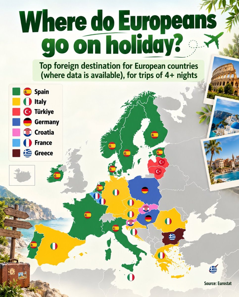 European holiday destinations infographic
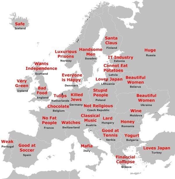 Japanese stereotypes of Europe
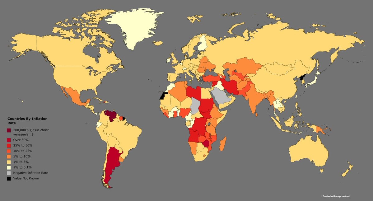 countries inflation rate ranking
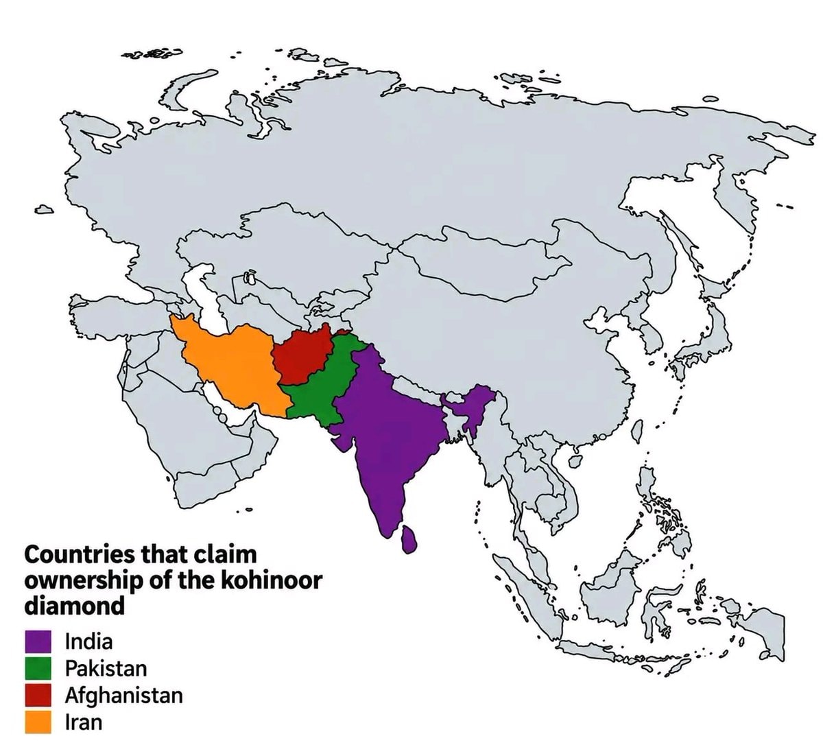 Koh-i-Noor diamond territorial claims
@savageupdatesBro actually comparing nations where tea is the main drink versus places where coffee rules, different populations drinking different things
Ver publicação originalFoto de @savageupdates· Oct 6, 2026· Info/Editorials
The image is an infographic comparing tea-drinking countries and coffee-drinking countries. A world map is colored green for tea countries and brown for coffee countries, with a legend explaining the color coding. Below the map, statistics show that 3.6 billion people prefer tea and 2.5 billion people prefer coffee. The overall style is informative and data-driven. Visually notable are the distinct color blocks representing the beverage preferences across continents and the clear presentation of global consumption data. ON-SCREEN TEXT: TEA COUNTRIES VS. COFFEE COUNTRIES THE MOST CONSUMED BEVERAGE IN EACH COUNTRY TEA COUNTRIES Tea is the most consumed beverage COFFEE COUNTRIES Coffee is the most consumed beverage NO DATA AROUND THE WORLD 3.6 BILLION PEOPLE PREFER TEA AROUND THE WORLD 2.5 BILLION PEOPLE PREFER COFFEE CULTURES. HABITS. PREFERENCES. THAT'S WHAT MAKES THE WORLD UNIQUE. Source: World Atlas, Statista, Euromonitor, 2023
Ainda não há comentários. Seja o primeiro!
US States Immigrant Population RankedBalkans fair division 2026Jewish population by U.S. countyUS states above 1000 meterswedding costs by stateWorld cities aligned with Europe latitudeRichest Cities by GDP 2025US cities rudest residents 2024languages of Africa mapworld's biggest mines infographicEurope in 1942country always forgottenCountries omitted from world mapscentral Europe Gulf of Germany mapEuropean holiday destinations infographicJapanese stereotypes of Europecountries inflation rate rankingKoh-i-Noor diamond territorial claims
Ainda não há comentários. Seja o primeiro!