
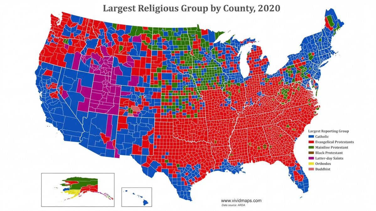
@savageupdatesA 2020 dataset identifies the largest religious group within each U.S. county. #UnitedStates
Ver publicação original@savageupdatesA 2020 dataset identifies the largest religious group within each U.S. county. #UnitedStates
Ver publicação originalFoto de @savageupdates· Sep 1, 2026· United States
The image is a map of the United States showing the largest religious group by county in 2020. The map uses different colors to represent various religious affiliations, with a legend indicating that blue signifies Catholic, red signifies Evangelical Protestants, green signifies Mainline Protestant, brown signifies Black Protestant, purple signifies Latter-day Saints, yellow signifies Orthodox, and pink signifies Buddhist. The map has a clean, data-driven aesthetic. Visually notable is the stark contrast between the predominantly red (Evangelical Protestant) Southeast and the blue (Catholic) Northeast and Southwest. The map includes the website "www.vividmaps.com" and "Data source: ARDA" at the bottom.
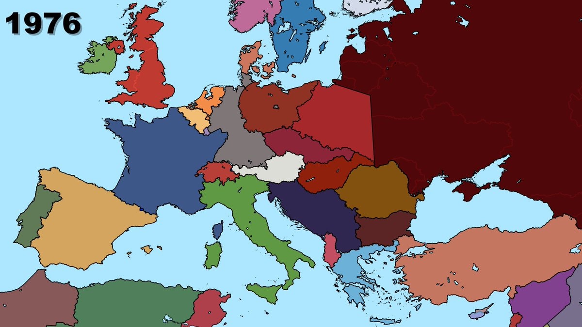 2Europe map 1976
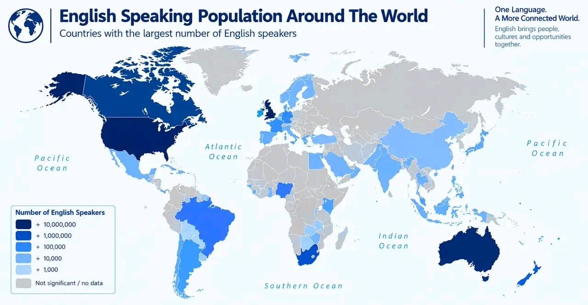 English Speaking Population Around The World
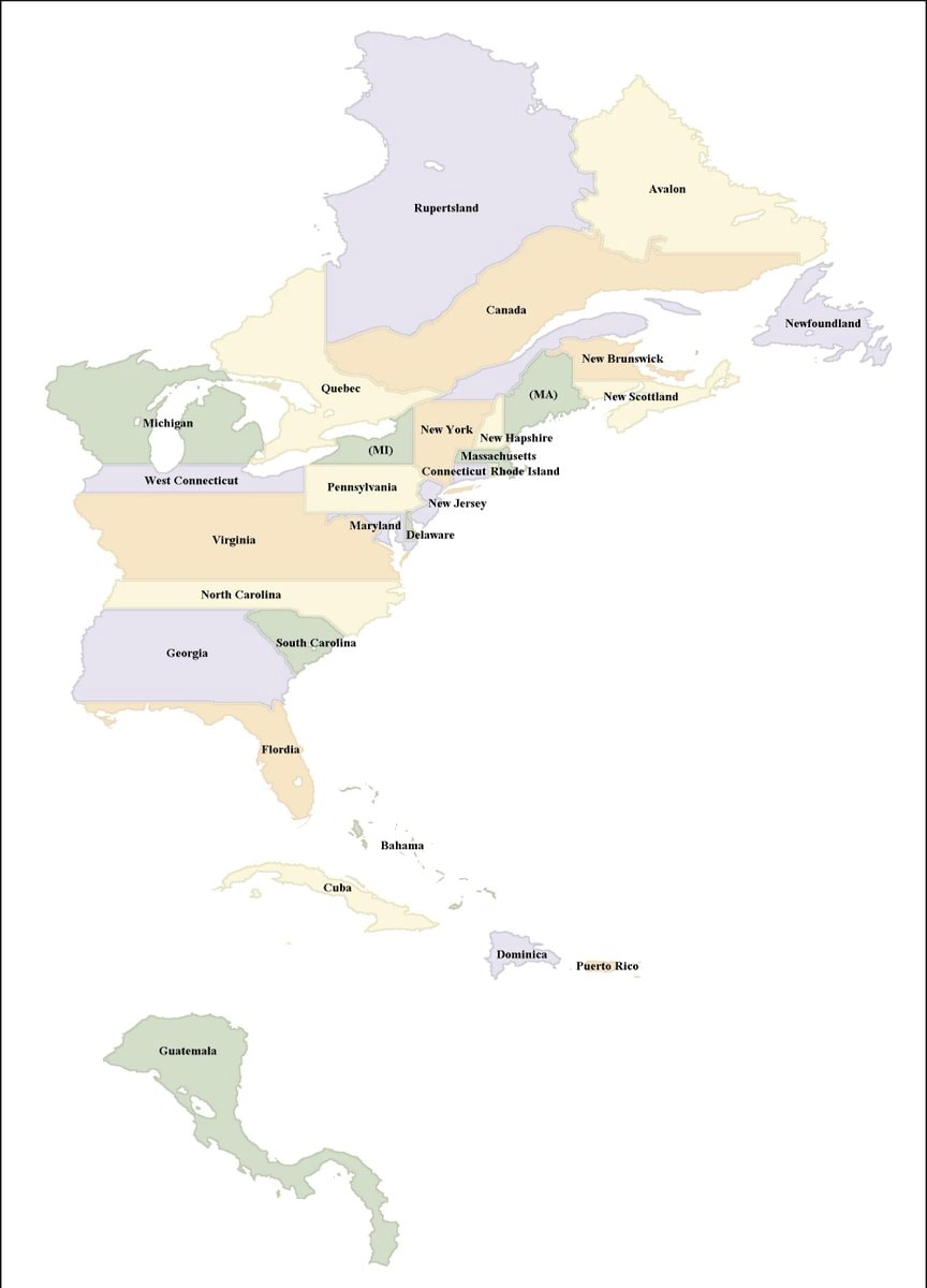 usa tall instead of wide map
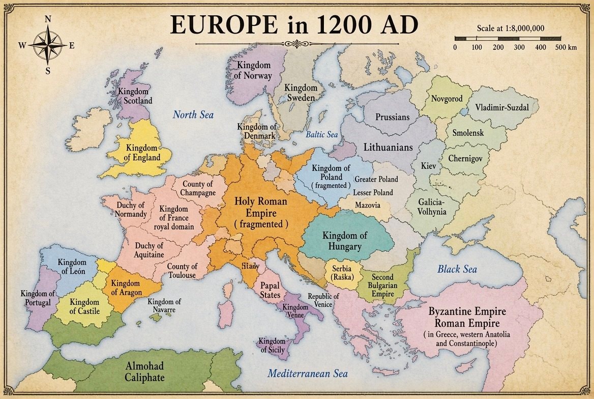 Europe in 1200 AD
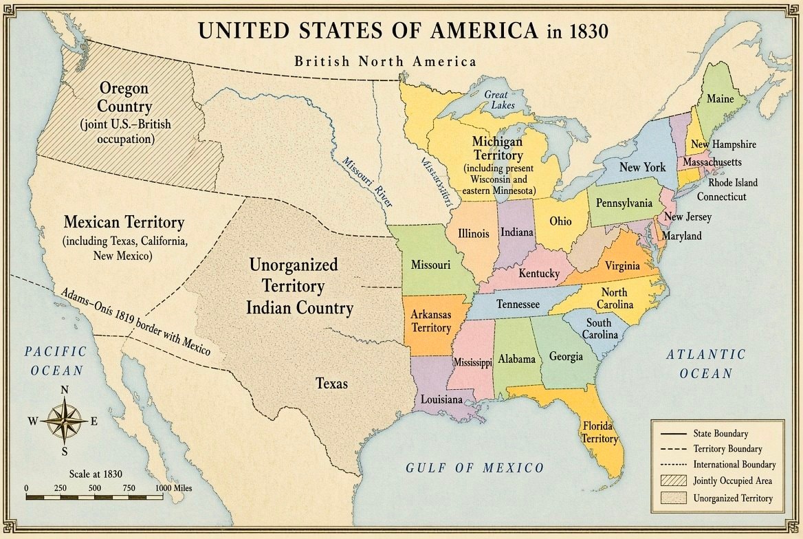 United States map 1830
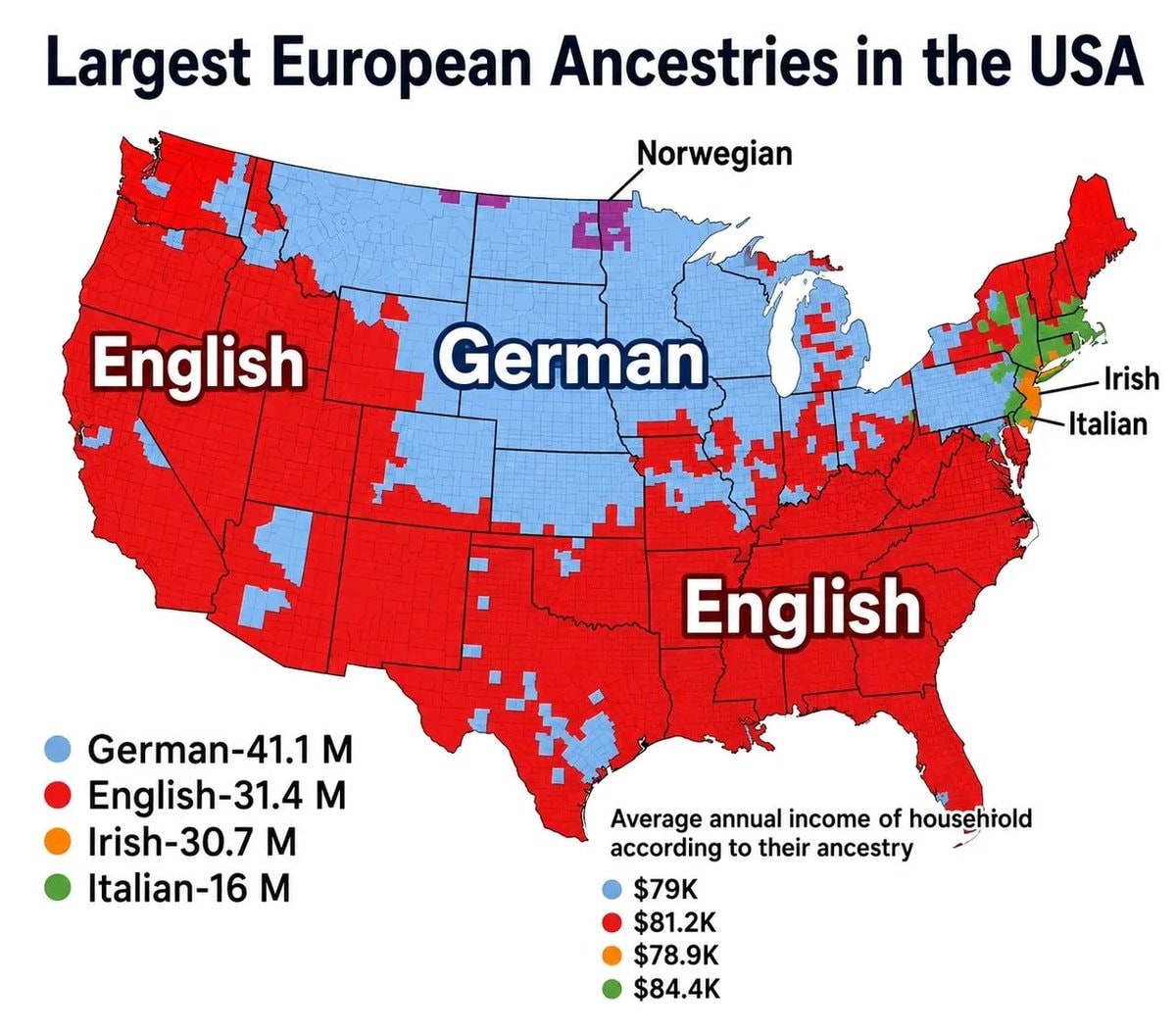 European ancestries map of the USA
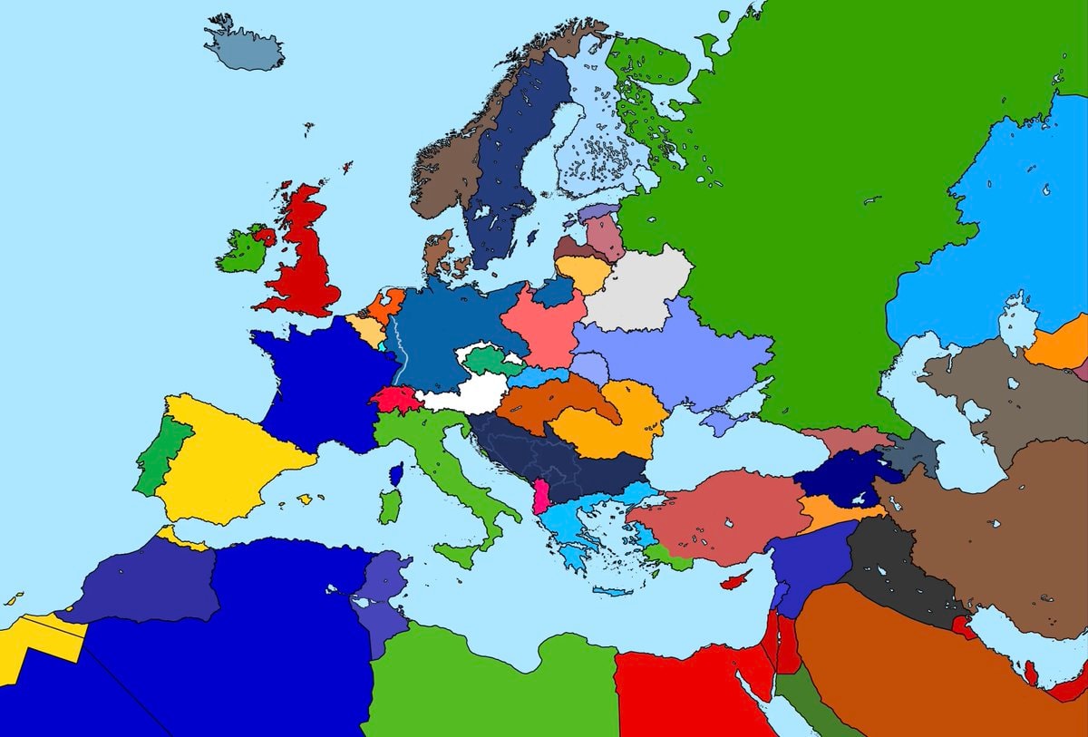 Alternate map of Europe after world war one
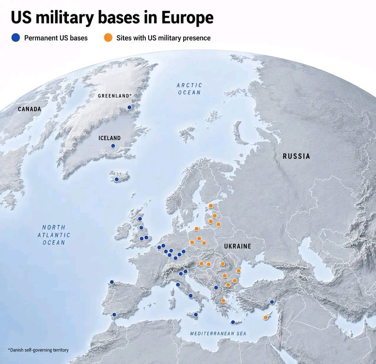 US Military bases in Europe
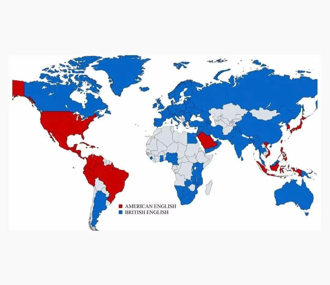 British vs American English school teaching
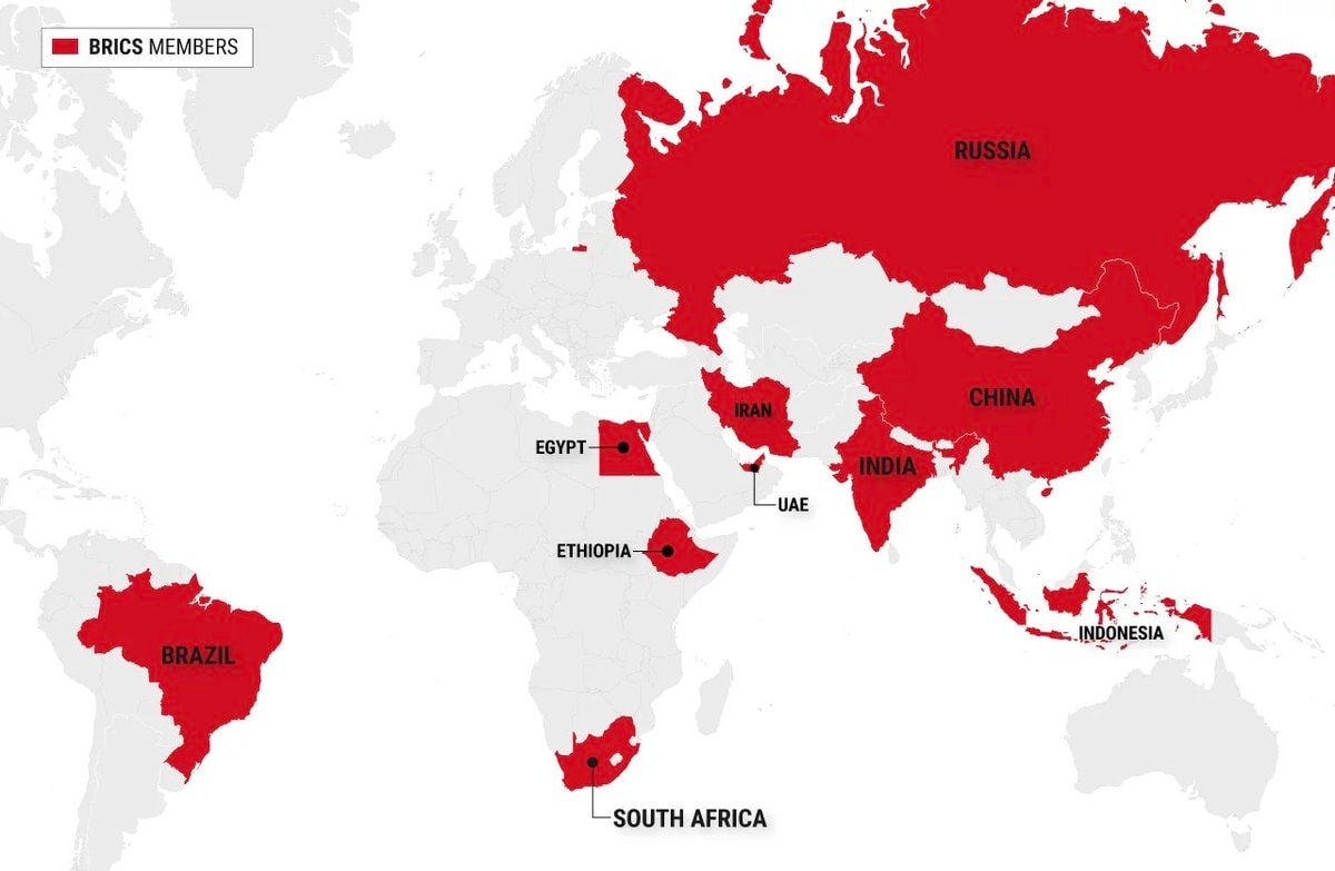 BRICS member countries map
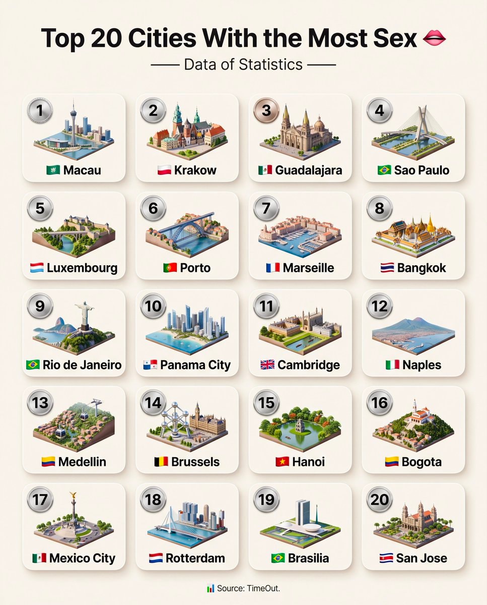 Top 20 Cities With the Most Sex
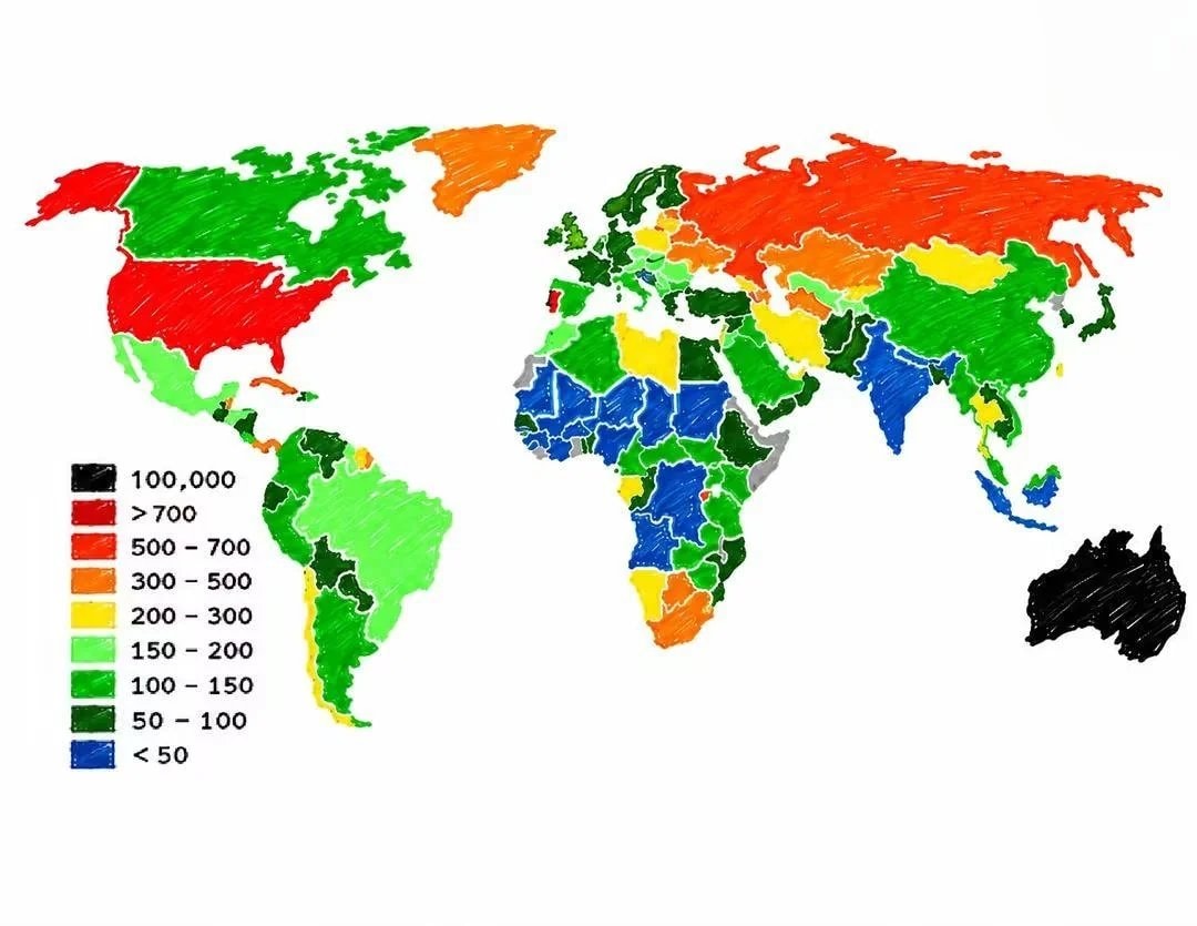 Prison population per 100,000 people
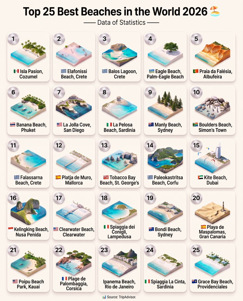 Top 25 Best Beaches in the World 2026
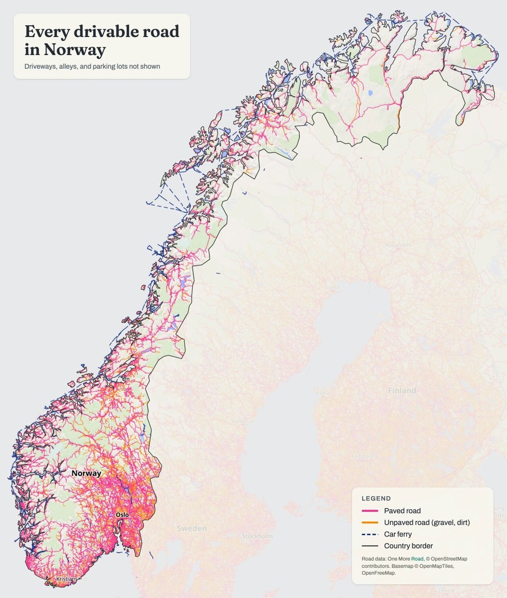 Norway drivable roads map
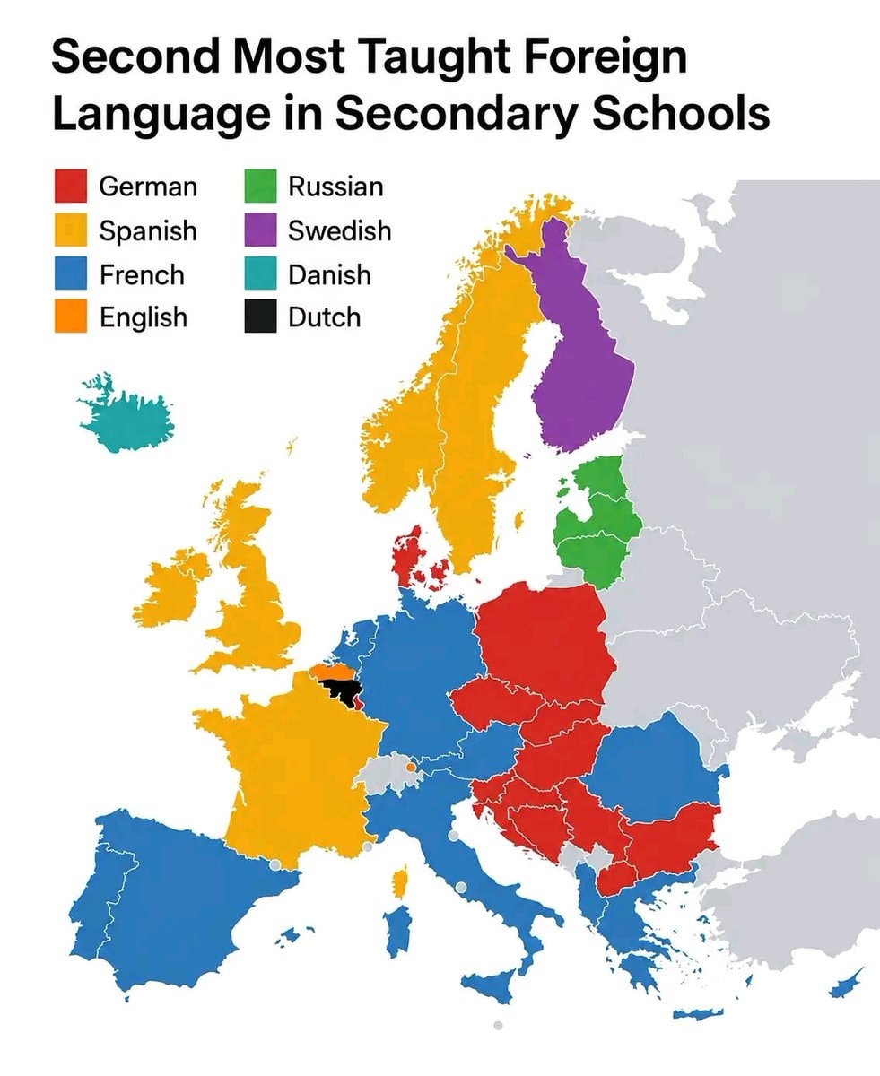 Second Most Taught Foreign Language in Secondary School
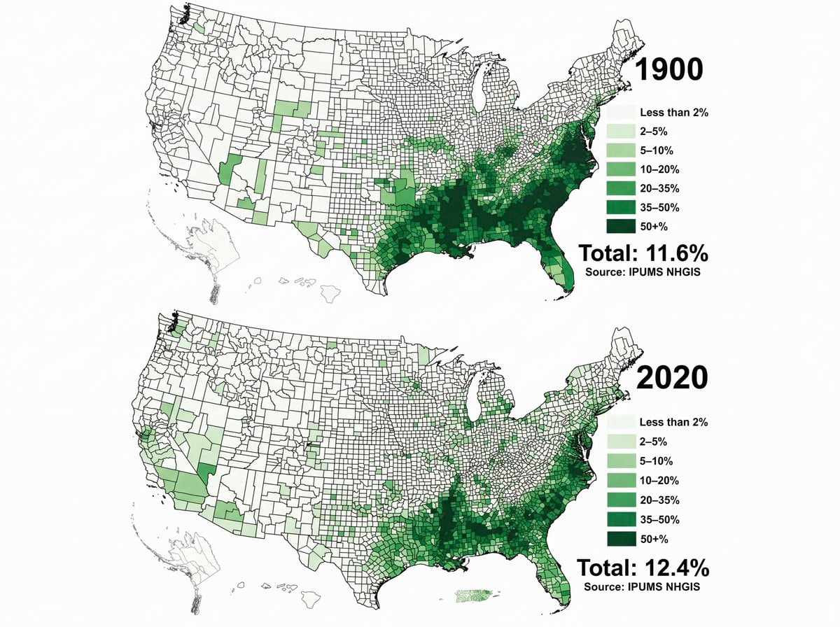 Black Population US 1900 vs 2020
 33 Things That Didn't Exist 25 Years Ago
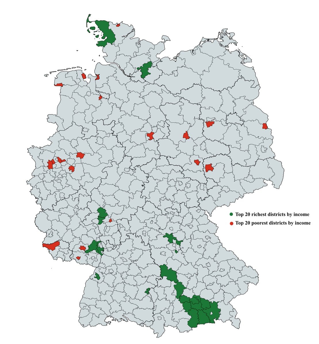 richest and poorest areas in Germany
@savageupdatesA 2020 dataset identifies the largest religious group within each U.S. county. #UnitedStates
Ver publicação originalFoto de @savageupdates· Sep 1, 2026· United States
The image is a map of the United States showing the largest religious group by county in 2020. The map uses different colors to represent various religious affiliations, with a legend indicating that blue signifies Catholic, red signifies Evangelical Protestants, green signifies Mainline Protestant, brown signifies Black Protestant, purple signifies Latter-day Saints, yellow signifies Orthodox, and pink signifies Buddhist. The map has a clean, data-driven aesthetic. Visually notable is the stark contrast between the predominantly red (Evangelical Protestant) Southeast and the blue (Catholic) Northeast and Southwest. The map includes the website "www.vividmaps.com" and "Data source: ARDA" at the bottom.
Ainda não há comentários. Seja o primeiro!
2Europe map 1976English Speaking Population Around The Worldusa tall instead of wide mapEurope in 1200 ADUnited States map 1830European ancestries map of the USAAlternate map of Europe after world war oneUS Military bases in EuropeBritish vs American English school teachingBRICS member countries mapTop 20 Cities With the Most SexPrison population per 100,000 peopleTop 25 Best Beaches in the World 2026Norway drivable roads mapSecond Most Taught Foreign Language in Secondary SchoolBlack Population US 1900 vs 202033 Things That Didn't Exist 25 Years Agorichest and poorest areas in Germany
Ainda não há comentários. Seja o primeiro!